Everyone Wants Data Until They See It - Lessons in Making Metrics Useful
“Can you just make us a quick dashboard?” “We want something insightful.” “Add all the filters so people can self-serve.”
I would always get excited when I heard things like this. As a BA, access to data and dashboards is my bread and butter. Building something insightful felt like I was making a difference.
But over time, a pattern started to emerge that made me realise one simple truth:
Everyone wants data… until they actually see it.
Then they ignore it. Or misread it. Or never log in to the dashboard again.
It took me a while to realise the problem wasn’t the complexity of the data itself. It wasn’t even the dull default design templates.
Most dashboards fail because no one knows what to do with them.
Case Study: "insightful" dashboard that no one used
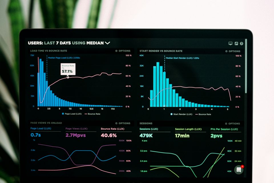
A while ago, I was asked to build a “sales visibility dashboard” for the Sales Ops team. It seemed straightforward. I had access to everything needed: CRM data, historical performance, quota trends and benchmark reports.
I was excited. I wanted to impress my new team. I was fresh out of academia. So I built a sleek, complex dashboard using pretty much every concept I had learned in my quantitative data analysis module at uni. My approach was very prim and proper. Very academic.
And lo and behold - I had the dashboard. It had everything. And I mean everything you could think of (and more).
Monthly and quarterly performance trend lines? Check. Heatmaps by region and offering category? Check. Leaderboard of account managers by closed-won ratio? Check. A toggle feature to compare YoY trends? Once again, check.
It looked complicated, logical, visually polished, sophisticated. As I later came to realise, it also had too much of everything. Thus soon learned: If your dashboard has everything, it may as well have nothing.
A few weeks after delivering my masterpiece, I checked the usage metrics. To my surprise the numbers were disappointing.
Three total visits. Two of them were me.
Needless to say, it didn’t feel great.
Not All Metrics Are Useful
That uncomfortable and genuinely humbling experience changed everything about how I approach data. It also nudged me toward business analysis as a career.
I realised that outside the safe walls of academia, complex, mathematically-sophisticated data manipulations don’t hold much intrinsic value. Sure, it might look impressive. It might even feel insightful. But insightful doesn’t always mean useful.
As pretty as a well designed dashboard may look it's not exactly a museum exhibit. Most people don’t come to a dashboard to admire it, they come with a purpose to extract something from it. Something they can understand quickly, something they can trust to be true and something they can act upon. And if that something doesn’t clearly lead to a decision or behaviour change, then what’s the point?
What I had built assumed a shared understanding of goals, data literacy and business context. That was naive and completely disconnected, It was the exact opposite of what I wanted this dashboard to achieve.
Looking back, I can see exactly what was missing: an action layer. I showed everyone what was happening. Not just the headlines, but everything. And most importantly, it offered no guidance on what to do about it.
The 3 Mistakes I Made
Looking back at my first attempt at a CRM dashboard, I can clearly spot three major issues with the first iteration:
1. Too much flexibility = decision fatigue
What I thought was user empowerment turned out to be user overwhelm. The sections, filters and toggles that I had proudly built to cover every scenario, created so much friction that people didn’t even know where to start. It looked like a dashboard, but felt like a maze.
2. Misaligned metrics and KPIs
This one still makes me cringe. The metrics I highlighted were based on what I thought was interesting and not what sales managers actually needed to run effective pipeline reviews or coaching sessions. In hindsight, it was a cardinal sin: assuming without validating.
3. No connection to real workflows
Most painfully, the dashboard existed in complete isolation, like a beautifully designed tropical island that no one could live on. There was no embedded workflow, no tie-ins to team chats, Slack threads or performance check-ins. No nudges, no triggers, no integration. She was a loner.
Eureka Moment: Thinking About Data Like a Product
That monumental flop was a turning point in how I approach data as well as how I approach my work in general. I stopped thinking rigidly and academically like a “data person” and started thinking more like a product manager.
No piece of work exists in isolation or for its own sake. Watching the senior PMs on my team (who were absolute superstars in their field) I started to notice patterns in not just what they did, but how they thought.
Whatever problem we faced, their minds immediately jumped to a series of clarifying questions to help scope the problem effectively. So I started doing the same, especially in relation to my dashboard conundrum.
I began asking myself:
- Who is the actual user of this dashboard?
- What decisions are they trying to make?
- When will they be opening it during their workflow?
- What might prevent them from doing that?
Below are some of the practical insights that came out of this shift in thinking.
Jobs To Be Done (JTBD): What’s the Dashboard Hired To Do?
Instead of thinking about a dashboard as just a visualisation of data, I started thinking of it as a product.
( In fact, I would argues that every deliverable in a business should be looked at this way. )
The guiding question in dashboard design can not be “What KPIs was I asked to show?” This barely scratches the surface. Here are some better questions worth asking before you build anything:
- What decisions are stakeholders trying to make more confidently or quickly?
- Which ambiguous processes could use a little more clarity and where data might help?
- Are there team habits or behaviours we want to change, reinforce or challenge through what is shown?
I would urge everyone working with data to treat it less like a static snapshot and more like a narrative. Something with intent that is embedded in the rest of the business.
This is where Jobs To Be Done (JTBD) comes in. It’s a framework that shifts the focus away from features and towards real use cases. The same thinking applies beautifully to dashboards.
Try writing a simple job statement for each dashboard you build. For example:
“When a sales manager reviews weekly performance, they want to identify underperforming reps early so they can intervene before the end of the quarter.”
That job becomes your dashboard design spec. It tells you what to include, what to leave out and what truly matters for those that use it.
Action-Oriented Metrics: Designing Data That Drives Decisions
The second principle I rely on is something I call Action-Oriented Metric Design(AOMD) The name says it all: every metric should nudge the user toward action, not just sitting there and look pretty.
To make sure that metrics are genuinely useful, I run them through the following three simple filters:
- Clarity: Is the metric instantly understandable at a first glance, without much prior context?
- Actionability: Does it suggest a clear next step or highlight where intervention is needed?
- Relevance: Is it connected to a decision, behaviour or workflow the user already cares about?
This way of thinking draws on how product teams approach North Star metrics and input/output metrics. A vanity metric like “total page views” may look good but it rarely leads to action. Instead, focus on trigger metrics i.e. the ones that highlight friction/opportunity and prompt a response.
For example:
“Accounts with no sales activity in the last 14 days”
“Reps with 3+ deals stuck in pipeline for over 30 days”
These kinds of metrics do more than inform, they direct. They serve as internal signals that something needs attention now. Designing with this mindset helps turn dashboards from passive reports into tools that actually shape how teams work.
Usage-Led Design: Let Behaviour Drive The Build
No matter how well-designed your dashboard is, it’s worthless if your team never opens it. To make sure it gets used, you need to design your dashboard with the same care and appeal as any great product.
What does this look like in practice? It starts with understanding your team’s workflow and reducing friction wherever possible. Here are three key principles to follow:
- Frictionless access
Integrate the dashboard seamlessly into tools your team already uses, like Slack alerts or embedding it in Notion. This way users don’t have to break their work flow to find the data they need.
- Progressive disclosure
Show the most important metrics front and centre. Keep detailed or complex data hidden behind expandable sections. This avoids overwhelming users and lets them dive deeper only when necessary.
- Behavioural nudges
Use clear visual cues and language to prompt action. A traffic light system (green, amber, red) paired with simple, direct prompts e.g. :
“🔴 5 reps haven’t updated deals in 7+ days. Reach out?”
These cues make it obvious when attention is needed and guide users toward the next step.
The points above are just a few examples of approach is inspired by Information Foraging Theory, which compares users to hunters looking for information. If the path to value is too long or unclear, users will simply abandon the search. It is also supported by frameworks from usability and behavioural science, including Jakob Nielsen’s 10 Usability Heuristics and The Fogg Behaviour Model. These frameworks highlight that action happens only when prompt, ability and motivation come together. I strongly suggest getting to know these frameworks if you want to level up in data or product work.
Dashboards as Dynamic Decision Tools
Stop treating BI reports as one-and-done deliverables. Think of your dashboards like interactive systems that evolve based on how users engage with them. Just like web or mobile apps, you can track how people use your reports (e.g. what they focus on, what they ignore) and use that feedback to make your dashboards smarter and more useful.
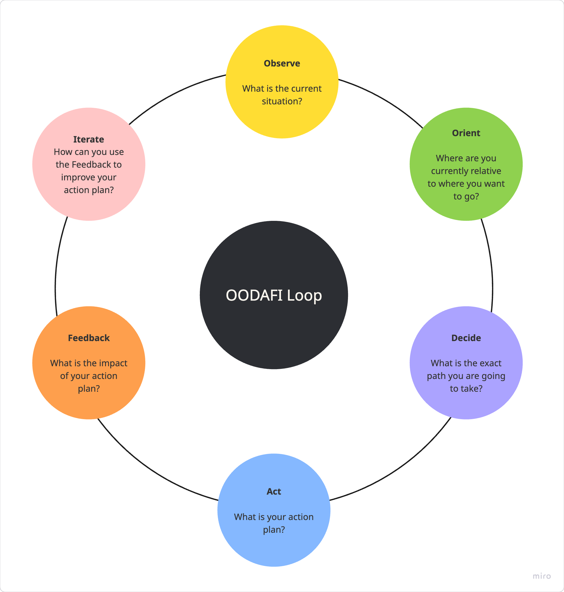
I view dashboards as feedback loops, not static outputs. A useful way to frame this is with the OODA loop - originally developed for military strategy (something I learned during my International Relations MA ) but incredibly useful in fast-moving product and business environments.
OODA stands for:
- Observe: Gather data and monitor what’s happening
- Orient: Make sense of the data in the context of your goals and environment
- Decide: Choose the best course of action based on your understanding
- Act: Take that action quickly and confidently
For Business Intelligence and Dashboards, I add two more crucial steps to complete the loop:
- Feedback: Track how users interact with your dashboards and the impact of your actions
- Iterate: Use that feedback to improve your dashboards and decision process continuously
So your loop looks as following:
How this works in practice:
When building dashboards, start by observing key metrics that matter. Then orient yourself by understanding what those metrics mean for your business goals. Decide on the best actions for your team and act accordingly. After deployment, collect feedback on how the dashboard is used and its outcomes. Finally, iterate to refine and optimise your dashboard. This cycle helps you spot problems early ( like falling user engagement or lagging feature adoption ) and adjust your approach fast.
Round 2 – A CRM Dashboard That Actually Worked
A month later, after staring at the dashboard I had built and realising no one else seemed to see its potential, I scrapped the whole thing and started again from scratch, this time with product and UX design principles front and centre.
The planning phase took way longer than the first time. I treated this like I was the founder of a startup designing a solution for an external client rather than building something internal to tick a box. I wrote a mission statement and defined the exact problem I was solving.
And that problem was simple:
Sales managers didn’t know which reps weren’t using the CRM consistently. As a result, leads were falling through the cracks and deals were being missed.
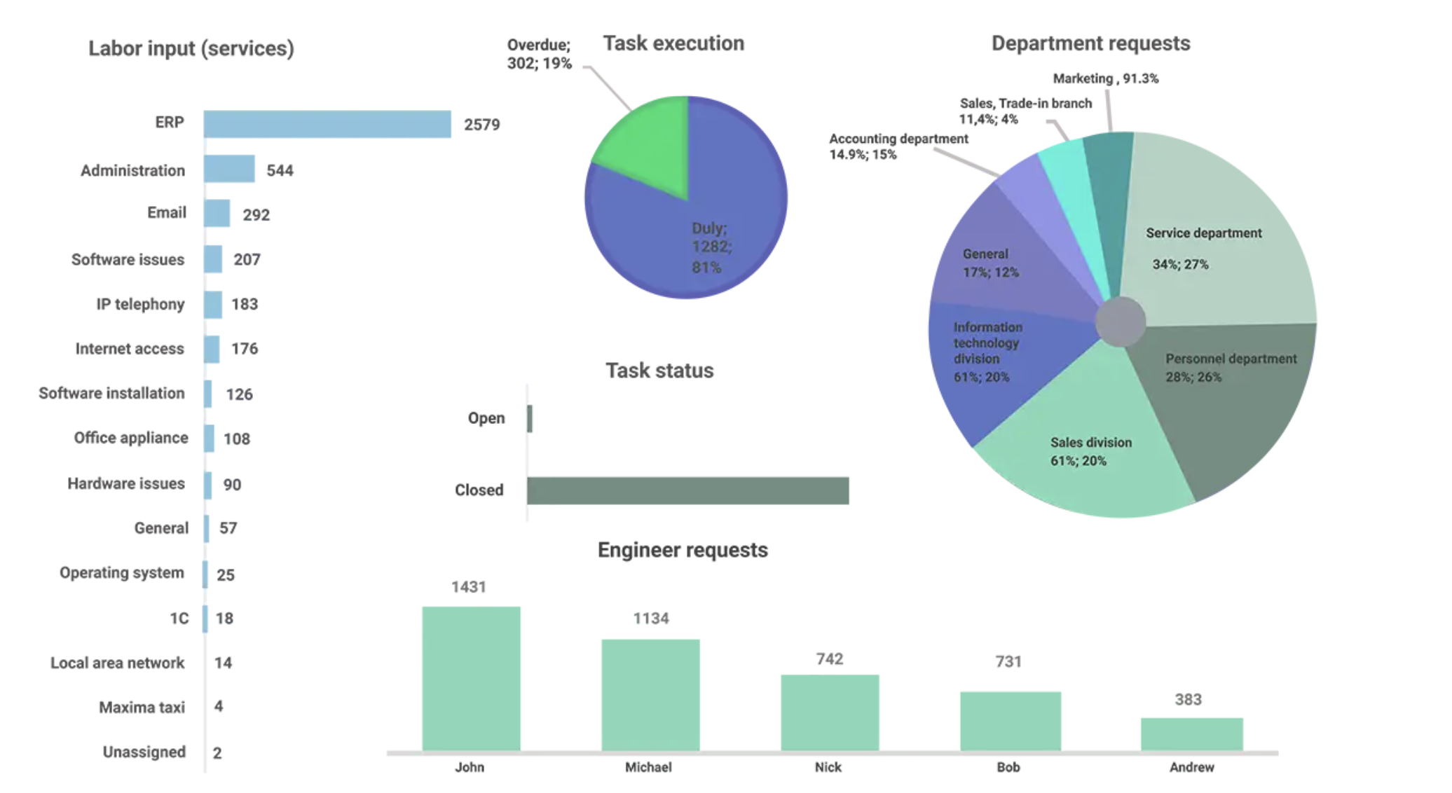
So I built a minimalist dashboard focused on exactly that problem and only that problem. The entire product centred on a few key metrics:
🔴 Reps with <3 logins per week
🔴 Leads untouched in 7+ days
🟠 Deals stuck in pipeline >14 days
✅ Closed-won deals with completed CRM notes
Each one was specific, time-bound and directly linked to a coaching action.
The dashboard wasn’t as "cool looking" as the original version but it landed much better. Usage went up 5x within weeks. Sales managers actually started using it in weekly pipeline reviews. They stopped chasing updates via email and Teams and thus the dashboard saved hours of chasing. Eventually, other teams (Telecoms, Logistics) saw it and wanted their own versions.
Conclusion: Why This Matters for Product & Analytics
As a PM (or even someone thinking like one) your edge isn’t that you can work with data. It’s that you can translate data into decisions. Every dashboard should be a tiny decision-supporting tool rather that a museum of KPIs. The best dashboards live in the workflow of your teams rather than collect dust and stay untouched in some folder. They are tied to recurring and current rituals (pipeline reviews, team check-ins). They are designed around real jobs-to-be-done and are focused on the next steps. For those in charge of creating BI Reports it is vital you:
- Designing with the user’s workflows in mind
- Choosing metrics that influence behaviour
- Treating dashboards like products with UX, adoption curves and retention
As I said earlier, everybody wants data - until they actually see it.
So the job isn’t to surface everything. It’s to surface exactly what matters at the right moment, for the right user, in the right context.
That’s the shift: from static dashboard to living product. When you build with focus, simplicity and empathy, your dashboard becomes more than a report. It becomes a tool that actually drives outcomes. And that is what good product thinking and good analytics is really about.